Aged Moonshine Packaging: Five Creative Designs to Inspire You
Key Takeaways
- Creative packaging transforms moonshine from backwoods bootleg to premium craft spirit worthy of display.
- Mason jar evolutions with modern twists strike the perfect balance between heritage and luxury.
- Materials like copper accents, textured papers, and sustainable elements can dramatically elevate perceived value.
- Effective moonshine packaging tells a compelling story about your distilling process and brand history.
- Thoughtful packaging design can help small-batch distillers compete with larger brands while commanding premium prices.
The brown liquid in your glass isn’t the only thing that’s been transformed by time. Today’s aged moonshine has come a long way from its illicit backwoods roots, and the packaging revolution has been just as dramatic as what’s inside the bottle. As craft distillers continue to push boundaries, creative packaging has become the critical differentiator on increasingly crowded shelves.
At Moonshine Monthly, we’ve seen firsthand how the right packaging design can elevate a spirit from ordinary to extraordinary. The most successful craft distillers understand that their bottle is often the first handshake with potential customers – and in the premium spirits world, that first impression needs to convey quality, authenticity, and craftsmanship before the first drop touches the lips.
The Moonshine Renaissance: Why Packaging Matters More Than Ever

“The Moonshine Renaissance | Bon Appétit” from www.bonappetit.com and used with no modifications.
We’re living through a golden age of craft spirits where consumers are increasingly drawn to products with genuine character and compelling stories. This shift has transformed moonshine from a rough-and-ready backwoods booze to a respected craft category with premium expressions worthy of the top shelf. The packaging revolution has been central to this transformation.
Modern moonshine packaging must thread a challenging needle – honoring the spirit’s rebellious heritage while signaling the quality and refinement inside. This delicate balance is what separates standout designs from forgettable ones. The best packaging solutions manage to communicate authenticity without falling into clichéd territory.
According to industry data, craft spirits with premium packaging command price points 30-40% higher than those with standard presentation, even when the liquid inside is comparable. For small distillers operating on tight margins, this premium positioning isn’t just about aesthetics – it’s an essential business strategy that directly impacts the bottom line.
5 Stunning Aged Moonshine Packaging Designs Worth Copying

“Pink Elephant Hillbilly Moonshine …” from www.ebay.com and used with no modifications.
After analyzing hundreds of craft spirit packages over the years, I’ve identified five distinctive approaches that consistently capture attention, communicate quality, and drive sales. Each of these designs offers valuable lessons that can be adapted for your own moonshine brand, whether you’re just launching or looking to refresh your existing packaging.
These standout designs don’t just look good – they solve specific marketing challenges while creating memorable experiences for consumers. The best part? Many of these approaches can be scaled to work with various production budgets, making them accessible for craft distillers at different stages of growth.
1. Copper-Dipped Bottles with Handwritten Labels
The marriage of copper elements with handwritten details creates an immediate visual connection to traditional distillation methods. Brands like The Original Moonshine have masterfully employed copper-dipped bottoms that reference the copper pot stills used in authentic moonshine production for generations. This visual cue instantly communicates heritage and craftsmanship without saying a word.
What makes this approach particularly effective is the contrast between the industrial feel of copper and the intimate, personal touch of handwritten or hand-styled labels. This juxtaposition tells a compelling story: industrial-grade quality meets artisanal attention to detail. For aged expressions, copper also provides a warm, amber complement to the rich colors of barrel-aged spirits.
Implementation can range from actual copper-dipped glass to sophisticated printing techniques that mimic the metallic effect at a lower price point. Some distillers take this concept further with copper wire wrapping, copper neck bands, or copper-stamped details on the label itself.
2. Prohibition-Era Wooden Crates
Secondary packaging offers another opportunity to elevate the consumer experience, and nothing says “premium small-batch” quite like individually boxed spirits. The wooden crate approach taps directly into the prohibition-era imagery when moonshine was transported in unmarked wooden boxes to avoid detection. Today’s iterations maintain that secretive appeal while adding luxury touches.
The tactile experience of sliding open a wooden case creates a moment of discovery that enhances the perceived value of your product. This packaging style works particularly well for limited editions, special releases, or gift-oriented marketing campaigns. The natural variations in wood grain also ensure that each package feels unique, reinforcing the small-batch, artisanal positioning.
3. Mason Jar Evolution with Premium Touches
The mason jar remains the most iconic vessel in moonshine history, but today’s craft distillers are reimagining this classic container with premium enhancements. The most successful designs maintain the jar’s authentic silhouette while introducing sophisticated elements that signal quality. Custom embossing, heavy-base jars, and innovative closure systems all contribute to elevating the humble mason jar into luxury territory.
Some distillers have embraced square-shouldered variations that reference the mason jar heritage while providing more contemporary shelf presence. Others maintain the traditional round shape but add custom texturing, frosted sections, or debossed logos directly into the glass. These subtle modifications maintain authenticity while distinguishing your product from competitors and commercial knockoffs.

4. Storytelling Through Textured Labels
Multi-layered, tactile labels transform the unboxing experience into a journey of discovery that engages multiple senses. The most effective designs incorporate papers with visible grain, letterpress printing that leaves a physical impression, and strategic use of spot varnishes to create contrast between matte and glossy elements. These tactile elements invite consumers to physically engage with your packaging, creating a deeper connection.
Leading craft distillers are incorporating hidden elements like specialized printing that’s only visible in certain light, peelable layers that reveal production details, or thermochromic inks that change appearance when the bottle is chilled to proper serving temperature. These interactive elements transform passive packaging into an experience that consumers want to share with others, creating valuable word-of-mouth marketing.
For aged expressions, texture can also communicate the aging process itself. Rough-hewn papers that mimic barrel wood, label edges that appear slightly aged, or deliberate imperfections that suggest handcrafted production all reinforce the time-intensive nature of aged spirits.
5. Sustainable Materials with Vintage Appeal
Today’s consumers increasingly value environmental responsibility, creating an opportunity to align sustainable packaging choices with moonshine’s traditional roots. Recycled paper stocks, biodegradable corn-based plastics for closures, and reclaimed wood elements all speak to both heritage production and forward-thinking values. This combination resonates particularly strongly with millennial and Gen Z consumers who prioritize brands with authentic sustainable practices. For those interested in exploring more about moonshine production, here’s a guide on how much liquor 10 gallons of mash can make.
Some innovative distillers are even incorporating actual elements from their production process into their packaging – using char from their own barrels to create distinctive black label elements, embedding botanicals used in the distillation into handmade papers, or utilizing repurposed elements from their distillery in promotional displays. These authentic touches create packaging that tells your brand’s complete story from production to consumption.
Materials That Make the Difference in Moonshine Packaging
“Materials for Design – Counterprint” from www.counter-print.co.uk and used with no modifications.
The physical materials used in your packaging communicate quality long before your customer tastes what’s inside. Each material choice sends subtle signals about your product’s positioning, price point, and brand values. The tactile experience of handling premium materials creates a subconscious quality association that influences perception of the spirit itself.
Glass Varieties and Their Impact on Perceived Value
Not all glass is created equal, and the weight, clarity, and texture of your bottle makes an immediate impression. Heavy-base bottles with substantial heft signal premium quality through the physical experience of weight in the hand. Extra-flint glass with exceptional clarity showcases the color of aged spirits, particularly those with rich amber hues that benefit from high transparency.
Custom molds with distinctive shapes or embossed elements dramatically increase memorability, though they require larger production runs to be cost-effective. For smaller producers, semi-custom options that modify standard bottles with unique closures or finishing techniques offer distinction without prohibitive mold costs. The strategic use of texturing – whether overall frosting, selective sandblasting, or embossed elements – adds tactile interest that elevates the consumer experience.
Paper, Fabric, and Natural Elements
Label materials serve as the primary canvas for your brand story, making paper selection one of your most critical decisions. Textured papers with visible grain create an immediate impression of craft and quality – cotton papers with deckled (torn) edges particularly evoke handmade heritage. Many distillers are exploring specialized papers containing natural elements like corn husks or grain chaff that directly reference their ingredients. For those interested in how moonshine evolves, learn about how moonshine ages over time.
Natural fabric elements add distinctive tactile dimensions while reinforcing the handcrafted narrative. Burlap neck wraps, twine closures, or small fabric pouches containing product information all provide opportunities to incorporate textiles. These natural materials age beautifully over time, developing patina that enhances rather than detracts from the packaging’s appeal, much like the spirit inside continues to develop character.
Metal Accents That Pop
Strategic use of metal elements creates focal points that catch light on retail shelves and add perceived value. While full copper or brass components make the strongest statement, even small metal accents like closure caps, medallions, or wire elements dramatically elevate packaging. The weight and coldness of metal creates sensory contrast with glass and paper elements, making the unboxing experience more engaging.
For producers working with more limited budgets, metallic foil stamping, specialized metallic inks, or high-quality printing techniques can create similar visual impact without the cost of actual metal components. The key is judicious use – metal elements should accentuate your design rather than overwhelm it.
Color Psychology for Aged Spirits
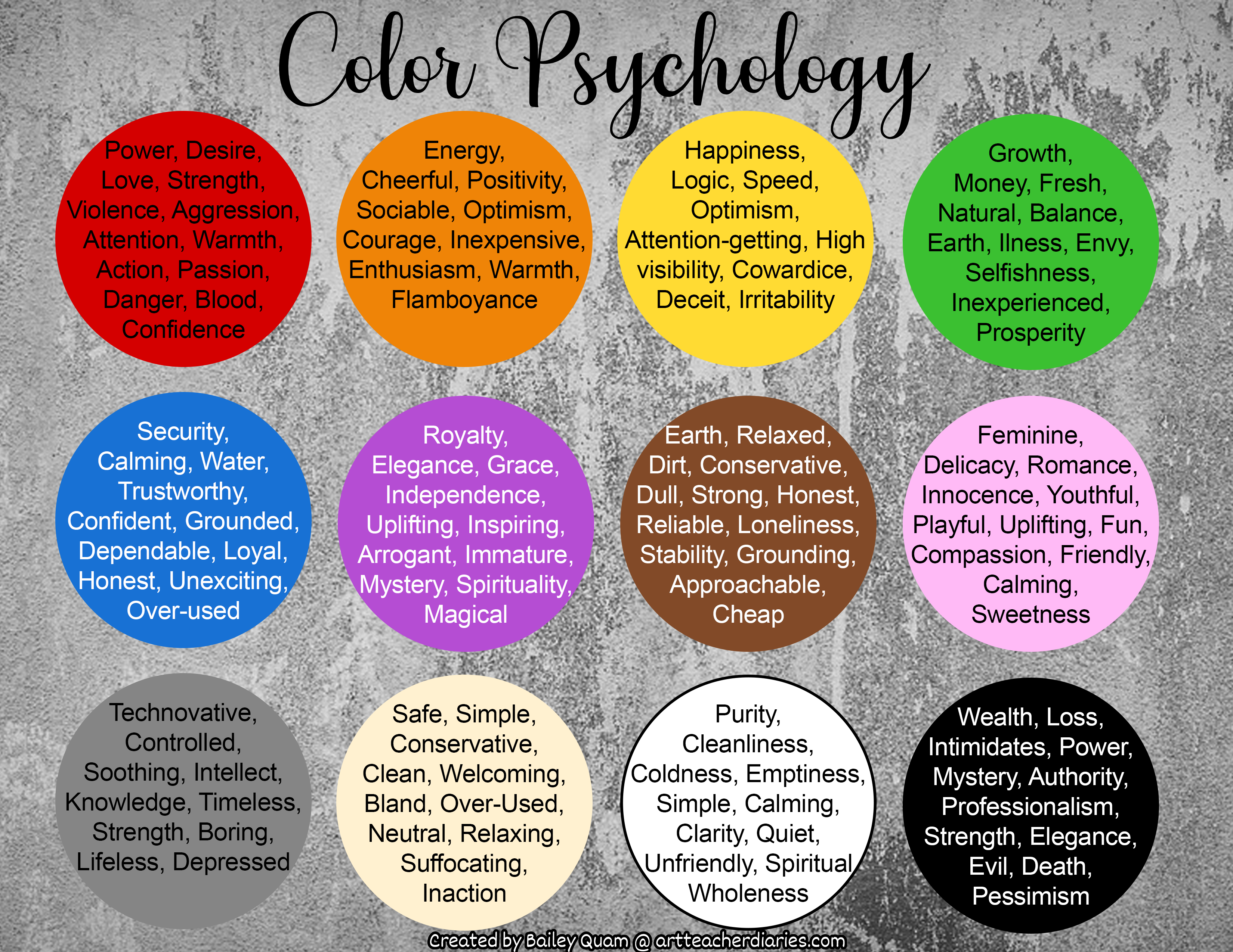
“Art Teacher Diaries” from www.artteacherdiaries.com and used with no modifications.
Color choices communicate crucial information about your product before a single word is read. For aged moonshine, your palette selection should reinforce the aging process while differentiating your product from both clear moonshine and traditional whiskies. The most effective color strategies acknowledge category expectations while establishing distinctive brand identity.
Amber and Brown Tones: The Trust Palette
Amber, copper and warm brown tones create immediate association with barrel aging while suggesting warmth and approachability. These colors naturally complement the liquid inside, creating visual harmony between product and packaging. Studies show that amber tones also trigger associations with authenticity and tradition – critical perceptions for craft spirits seeking to establish credibility.
When working with this palette, consider subtle variations that distinguish your brand. Deep honey tones, rich chestnuts, and burnished coppers offer nuanced alternatives to standard browns. Combining several tones from this family creates depth and dimension that flat color applications cannot achieve.
Metallic Finishes: When to Use Gold vs. Silver
Metallic accents serve as powerful quality signals, but their specific associations vary dramatically. Gold communicates premium value and tradition, making it particularly appropriate for longer-aged expressions where time is a central selling point. Silver and platinum tones, by contrast, suggest precision, purity and modernity – potentially better choices for innovative aging techniques or contemporary brand positioning.
The contrast between metallic and non-metallic elements creates visual interest while directing attention to key information. Consider using metallics selectively for your brand mark, age statement, or signature, allowing these critical elements to catch light and stand out from the remainder of your design. For more on how to maintain the quality of your product, check out these storage conditions for aged moonshine.
Black and White: Minimalism That Speaks Volumes
While color often dominates packaging discussions, don’t underestimate the power of black and white minimalism, particularly for premium positioning. High-contrast black and white designs signal confidence and sophistication, allowing the amber spirit inside to provide the color element. This approach works particularly well for brands targeting urban markets or aiming for placement in high-end cocktail programs.
The key to successful minimalist design lies in exceptional execution – paper quality, printing precision, and typographic details become even more important when working with a restricted palette. When every element is visible without the distraction of color, each design decision must be deliberate and refined.
Typography Choices That Enhance Authenticity
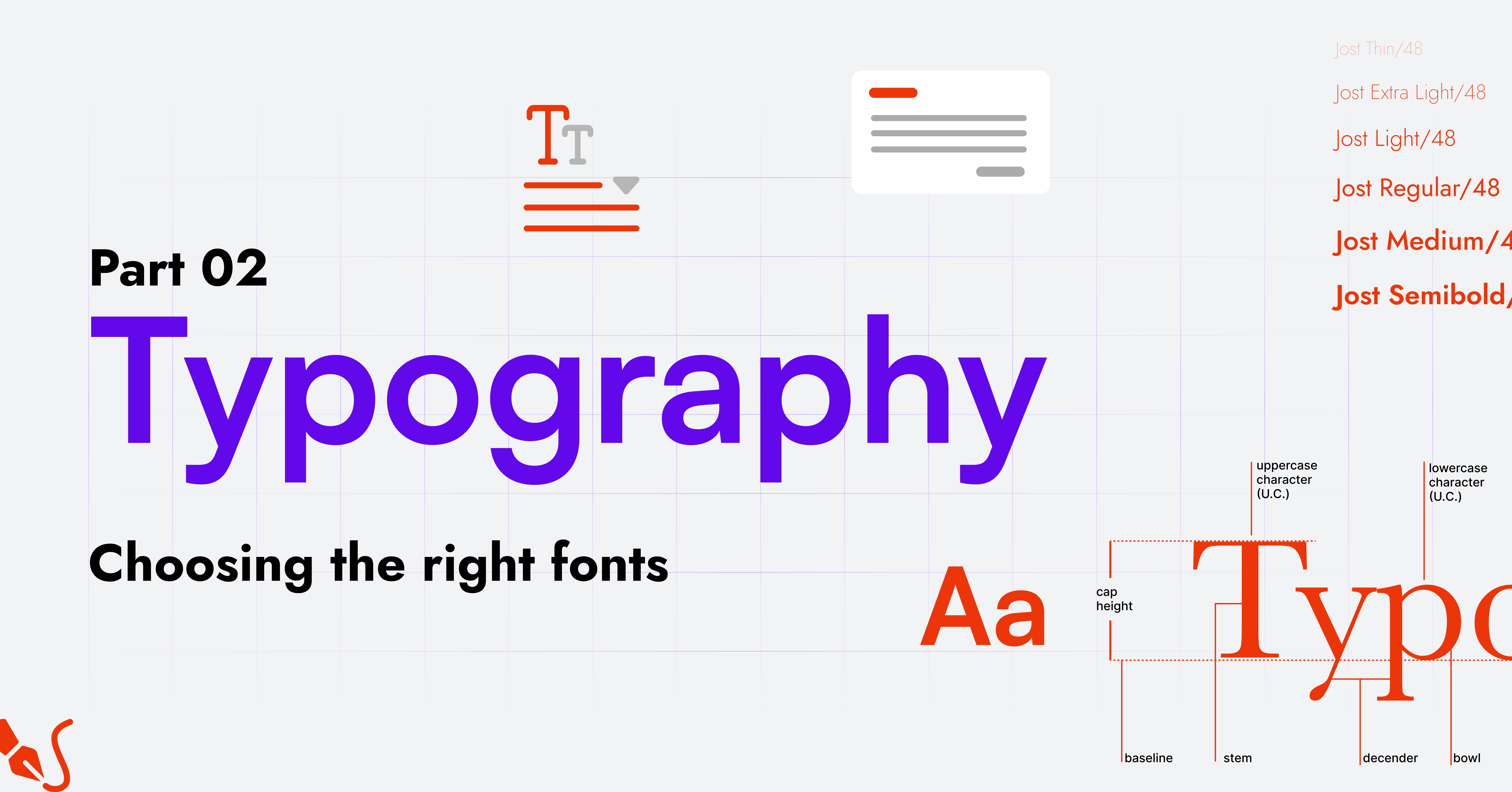
“Guide to TYPOGRAPHY part 2. In this …” from medium.com and used with no modifications.
Typography often communicates more about your brand’s personality than any other design element. For aged moonshine, your font selections should balance heritage cues with legibility, creating a distinctive voice that aligns with your brand story. The most successful designs utilize typographic contrast to create clear information hierarchy while maintaining cohesive visual identity.
Hand-Lettered vs. Vintage Fonts
Custom hand-lettering creates truly unique brand identity impossible to duplicate with standard fonts. This approach feels authentically artisanal, particularly when the lettering style references historical moonshine or prohibition-era typography. The subtle irregularities in truly hand-lettered designs signal human involvement – a powerful differentiator in an increasingly digital world.
For brands without access to custom lettering, carefully selected vintage typefaces can achieve similar effects. Look beyond the obvious choices to discover lesser-used historical fonts with distinctive character. Combining several complementary vintage fonts creates rich typographic texture while maintaining period authenticity. The key is avoiding fonts that have become cliché through overuse in the craft movement.
Creating Hierarchy on Your Label
Effective label design guides the viewer’s eye through information in order of importance. Size contrast remains the most powerful tool for establishing hierarchy – your brand name or spirit type should typically dominate, with supporting information in progressively smaller type. Strategic use of weight (bold vs. light), style (italic vs. roman) and spacing creates additional layers of hierarchy without requiring extreme size differences.
Consider how your typography will function in different contexts – a design that looks perfect in your hand may become illegible on a dimly lit bar shelf. Test your typography at actual size and in various lighting conditions to ensure it performs as intended in real-world environments.
From Concept to Shelf: Making Your Design Work
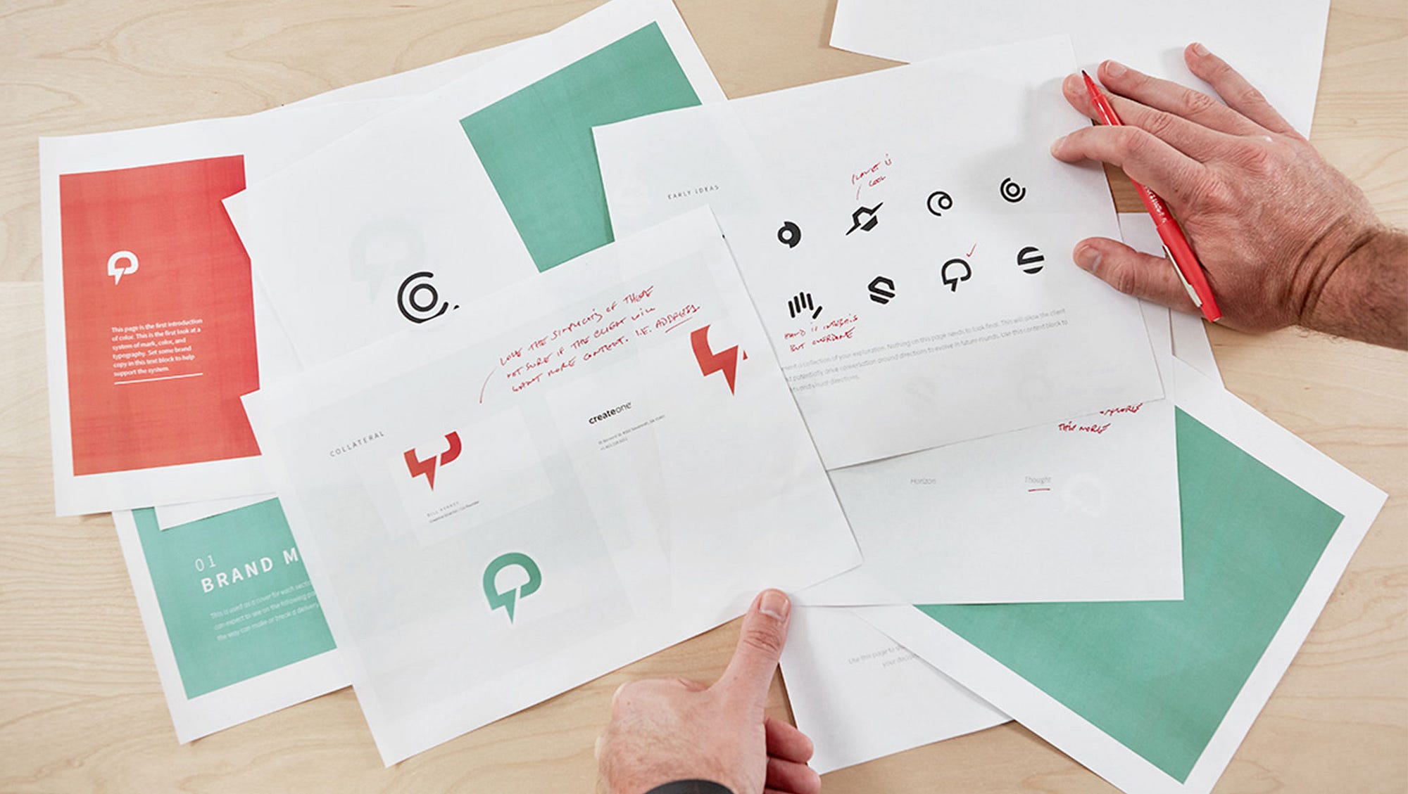
“How to Pitch your Design Work. Be real …” from medium.com and used with no modifications.
Even the most brilliant design concept must eventually face production realities. Understanding technical constraints, budget implications and implementation challenges from the beginning prevents costly revisions and production disappointments. The most successful packaging projects involve production partners early in the design process to ensure concepts can be executed effectively.
Budget-Friendly Production Tips
Custom glass molds represent the largest packaging investment for most craft distillers, with costs that can reach well into six figures. For more modest budgets, consider semi-custom approaches that modify standard bottles through distinctive labeling, closure systems, or secondary packaging. A standard bottle with exceptional finishing touches often outperforms a unique bottle with basic labels. If you’re curious about aging spirits, you might wonder does moonshine age well?
Consider how different production techniques scale with volume. Techniques like manual application of wax seals may be manageable for limited releases but become problematic at larger volumes. Design with your realistic production capacity in mind, or create tiered packaging approaches that can evolve as your volume increases.
Working With Printers and Manufacturers
Building strong relationships with production partners leads to better results and fewer costly surprises. Take time to educate yourself about their capabilities and limitations before finalizing designs. Many printers and packaging manufacturers offer material libraries, sample books, and mock-up services that allow you to test concepts before committing to full production.
When requesting quotes, be specific about materials, quantities, and special techniques to receive accurate pricing. Consider ordering slightly higher quantities than immediately needed – the per-unit cost typically decreases significantly at higher volumes, and having additional inventory provides buffer against unexpected sales growth or production issues.
Testing Your Design With Target Consumers
Before committing to full production, test your design concepts with actual target consumers. Simple techniques like placing mock-ups alongside competitor products and asking for reactions can reveal potential issues or opportunities. Pay particular attention to first impressions and shelf visibility – does your package stand out appropriately in its intended retail environment?
Focus groups and consumer testing need not be expensive formal affairs. Informal feedback from tastings, industry events, or social media can provide valuable insights. The key is soliciting honest reactions from people who match your target demographic rather than relying solely on opinions from those already familiar with your brand.
- Watch for handling issues – do consumers intuitively understand how to open and pour from your package?
- Test legibility in various lighting conditions that mimic actual usage scenarios
- Evaluate how your package photographs for social media sharing
- Consider how your design appears in e-commerce contexts with limited visual information
- Assess secondary use potential – will consumers keep or repurpose your packaging?
Don’t discount negative feedback or unexpected reactions – these often provide the most valuable insights for refinement. The goal isn’t creating a design everyone likes, but rather one that strongly resonates with your specific target consumer while functioning effectively across all usage scenarios.
Remember that packaging exists to serve both marketing and functional purposes. The most visually stunning design still fails if it doesn’t protect your product, pour properly, or fit standard shipping containers. Balance aesthetic considerations with practical requirements throughout the development process.
Standing Out in a Crowded Market

“3 Tips For Standing Out In A Crowded Market” from www.forbes.com and used with no modifications.
The craft spirits landscape grows more competitive each year, making distinctive packaging increasingly crucial for market success. The most effective approach combines deep understanding of category conventions with strategic differentiation in key areas. Rather than attempting to stand out in every aspect, identify specific design elements where nonconformity will create maximum impact while maintaining enough familiar cues to communicate your product category clearly.
Frequently Asked Questions
Having helped dozens of craft distillers develop their packaging over the years, I’ve encountered many common questions and concerns. These frequently asked questions address the most common challenges that arise during the packaging development process.
How much should I budget for custom moonshine packaging design?
Packaging development budgets vary dramatically based on your approach and production volume. At minimum, expect to invest $3,000-$8,000 for professional design services, with additional costs for photography, illustrations, or specialized typography. Production costs then scale based on your material choices and volume requirements.
Sample Packaging Budget Breakdown
Design services: $3,000-$8,000
Custom illustration/photography: $1,000-$3,000
Stock bottles (per 1,000): $1,200-$3,500
Custom glass molds: $15,000-$100,000+
Labels (per 1,000): $800-$2,500
Closures (per 1,000): $500-$1,500
Secondary packaging (per 1,000): $2,000-$8,000
Many craft distillers find success with phased approaches that begin with stock bottles and exceptional labels, then graduate to custom components as volume and margins allow. This strategy allows you to establish market presence while reserving capital for production and marketing essentials.
Remember that packaging is an investment rather than simply an expense – effective design directly impacts your pricing power and sales velocity. Packaging that enables a 10-15% price premium often pays for itself even at relatively modest volumes.
What’s the best way to communicate “premium” without looking pretentious?
The most successful premium packaging avoids obvious signaling in favor of subtle quality cues. Focus on material quality rather than decorative excess – substantial glass weight, textural elements that reward close examination, and precision in production details all communicate quality without appearing ostentatious. Authentic storytelling about your production process creates genuine value perception that synthetic luxury signals cannot match.
Consider how your packaging functions in its intended consumption context. A design that feels appropriately premium in a craft spirits shop might appear overworked in a high-end cocktail bar. Understanding your primary sales channels and typical consumption environments helps calibrate your premium positioning appropriately.
Are there legal requirements for aged spirit packaging I should know about?
Regulatory requirements for spirits packaging vary by market but typically include mandatory information about volume, alcohol content, health warnings, and product classification. Working with a regulatory consultant familiar with your target markets ensures compliance while avoiding costly revisions. Pay particular attention to regulations regarding age statements, which often have specific requirements about placement, visibility, and supporting information.
How can small-batch producers compete with large distilleries through packaging?
Small producers can leverage their agility to create packaging experiences that larger producers cannot practically execute. Handcrafted elements, batch-specific variations, and limited-edition packaging all capitalize on small-batch advantages. Consider how you might incorporate actual production elements – perhaps barrel staves, grain samples, or other authentic materials – into special edition packaging that tells your unique story.
Rather than attempting to match the production values of major brands, focus on authentic differentiation through elements that highlight your craft credentials. Handwritten batch numbers, visible variations that evidence human involvement, and packaging that evolves with seasonal productions all reinforce the small-batch narrative that larger producers struggle to credibly maintain.
What packaging elements best communicate the “aged” quality of moonshine?
- Amber and sepia tones that reference the color transformation that occurs during barrel aging
- Natural materials like wood, leather, or cork that themselves age beautifully over time
- Visual references to barrels, rickhouses, or other aging infrastructure
- Prominent age statements with supporting information about your aging process
- Bottling dates or batch numbers that emphasize the time investment in your product
The most effective aged spirit packaging creates subtle connections between the liquid transformation and the visual presentation. Consider how your packaging might itself show subtle evolution over time – perhaps through materials that develop patina, designs that incorporate batch variation, or collectible elements that encourage consumers to compare releases across time.
Remember that authenticity matters above all – consumers have become increasingly sophisticated about distinguishing genuine craft production from marketing artifice. Your packaging should honestly reflect your actual production methods rather than creating impressions your liquid cannot deliver upon tasting.
Packaging design represents one of the most consequential decisions any craft distiller will make. The right design creates a virtuous cycle of attention, trial, and loyalty while commanding premium pricing that improves your margins. Taking time to develop thoughtful, distinctive packaging that authentically represents your product will pay dividends throughout your brand’s lifecycle. For those interested in how packaging can affect storage, check out these essential facts about storage conditions for aged moonshine.
For small producers navigating the complex world of packaging design with limited resources, focusing on strategic elements that deliver maximum impact allows you to compete effectively against larger competitors. By understanding the principles behind successful craft spirit packaging, you can create designs that honor moonshine’s rebellious heritage while positioning your products for premium success in today’s sophisticated market. Discover more about storage conditions for aged moonshine to ensure your product maintains its quality.
Looking to dive deeper into the world of craft spirits packaging? Moonshine Monthly offers personalized design consultations to help you develop packaging that captures your unique brand story while maximizing shelf appeal and perceived value.